Our website uses cookies
OK

What we needed

When we started Brand Doula, we weren’t just launching a portfolio site. We were shaping the framework for the kind of studio we wanted to run — and the kind of work we wanted to be invited into.

We had already spent years helping others untangle their brand direction — refining ideas, rewriting positioning, reshaping service architecture. But this time, we were our own client.

And the question was clear:

Branding agency

brand doula

What kind of brand would we trust with our own voice?

The answer wasn’t in performance, trends, or industry jargon. It was in structure. In slowing things down. In giving clarity and context the same weight as creativity.

That’s how Brand Doula came to life — quiet, exact, and built to last.

What we did

That’s how we see branding.

Like a doula, we don’t replace the founder’s voice. We help shape and protect it through moments of change, uncertainty, or growth.

Our tone followed the same logic. Human, thoughtful, and clean. No overpromising. No fluff. We speak to founders and small teams who want to make better decisions, not just better-looking slides.

1

Naming and narrative

We chose the name Brand Doula carefully. A doula helps birth what’s already there. She is a gentle guide who provides support and reliability, helping to bring new life into the world.

2
Visual identity and art direction

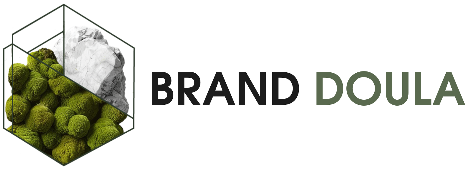
We wanted the visuals to support and express our identity. Our aim was to feel contemporary and ground ourselves in digital-native work while avoid the hyper-minimalist sameness that defines many agencies. We sought to bring freshness to this rigid world of digital plastic and metal by weaving in natural elements and creating a feeling of stepping away from the office desk and into a misty, mossy forest.

The instruments we used to bring this feeling:

  • Structure. We believe clarity isn’t just a value — it’s a design principle. That’s why our website and materials follow the same logic we apply to client work: clean hierarchy, no noise, and no hidden disclaimers in fine print. Every section has a purpose. Every word earns its place. If we stand for clarity, our structure has to reflect it.

  • Fonts. One typeface, Evolventa, used in varied weights and sizes. Unobtrusive, rational, quietly strong.

  • Color palette. Soft neutrals and light textures. Calm surfaces that don’t compete with the message.

  • Visual elements. A mix of realistic and graphic — moss, stone, and aerial textures meet digital wireframes and architectural geometry.

  • Symbolism. We borrowed from Greek sculpture — fractured marble, statue fragments — to reference the etymology of the word doula originating from Greek, while suggesting timelessness and care.

  • Animation. The site scrolls softly. Nothing jumps. The system holds together without pushing.

We use visual metaphor deliberately. Moss for grounded growth. Rock for stability. Classical form for tradition. Light, contemporary layout for digital relevance. It reflects the mix we work with: SaaS brands and physical products, tech clients and handmade labels.

Building Brand Doula was our own branding in practice — the same structure, questioning, and intentional pacing we use with every client.

It’s not a studio that rushes to rebrand. It’s a place where clarity becomes visible, structure holds the story, and identity grows out of logic, not decoration.

We’re not here to sell an aesthetic. We’re here to protect the idea behind it — and make sure it works.

Final Takeaways